
You are using an out of date browser. It may not display this or other websites correctly.
You should upgrade or use an alternative browser.
You should upgrade or use an alternative browser.
New Look Feedback Thread
- Thread starter admin
- Start date
Register to hide this ad

That_Titanium_4RNR
New member
Looks really good to me! The color scheme is easier on my eyes

Dezert4Runner
Senior Member
I can’t stand mobile view, I prefer classic view. Is there somewhere I can change the setting back? I don’t see the option anywhere...

ScarfaceT4R
New member
Highlighting text is green. Woahhhh...

Formidable
New member
Outstanding. I like how images are automatically resized. Ease of navigation.
And hopefully no more pop up ads! Lol
And hopefully no more pop up ads! Lol

BrianSD_42
New member
I can’t stand mobile view, I prefer classic view. Is there somewhere I can change the setting back? I don’t see the option anywhere...
I use chrome on Android and simply select Show Desktop Mode.


Team_Jake
Member
I do like the new look. Looks good on my laptop.
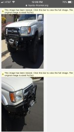
The mobile device site could use some work though. First thing I noticed was the oversized pictures on any thread has been squished so the pictures have a very tall aspect ratio. I would like to be able to request the desktop site using Safari on my phone, when I send the request on my phone nothing changes.
The mobile device site could use some work though. First thing I noticed was the oversized pictures on any thread has been squished so the pictures have a very tall aspect ratio. I would like to be able to request the desktop site using Safari on my phone, when I send the request on my phone nothing changes.


admin
Administrator
I do like the new look. Looks good on my laptop.
The mobile device site could use some work though. First thing I noticed was the oversized pictures on any thread has been squished so the pictures have a very tall aspect ratio. I would like to be able to request the desktop site using Safari on my phone, when I send the request on my phone nothing changes.
Can you post a screenshot from your phone?
Dezert4Runner
Senior Member
I use chrome on Android and simply select Show Desktop Mode.
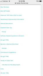
Desktop mode isn’t an option on Safari it seems. I guess the workaround would be for the admin to make it an option in the settings (or even better at the bottom of the home page) to revert back. That’s how most websites work that offer a mobile and desktop/ classic view.

FrenchToasty
New member
Desktop mode isn’t an option on Safari it seems. I guess the workaround would be for the admin to make it an option in the settings (or even better at the bottom of the home page) to revert back. That’s how most websites work that offer a mobile and desktop/ classic view.
Yeah looks terrible on safari and desktop mode doesn’t change anything. Hopefully change is good this time
Maybe you should, instead of giving it a new "paint job", put some effort in making the instructions for posting an ad a bit more user friendly and allowing pictures to be uploaded that are more than 1.7mb in size. Most photos, of high resolution are about 5-6 mb. I just uploaded 5 photos, the size of which I could not upload into an ad I was attempting to post on this website, onto and ad I posted in Craig's List; no problem. And, it sure would be helpful to notify someone that their add had been deleted and why it was deleted.
Team_Jake
Member
Can you post a screenshot from your phone?
Yeah, seems to only do this on oversized photos. Clicking the re-size yellow bar makes it worse.
Attachments
Dezert4Runner
Senior Member


roborob1969
Member
meh. everything is spaced out more with bigger fonts seems like -- no real change to form/function. still very old school looking. imo
The page numbers/page navigation all looks the same -- recommend at least bolding the active page and/or making the the page number a different color.
The page numbers/page navigation all looks the same -- recommend at least bolding the active page and/or making the the page number a different color.

Charlievee
Senior Member
First the ugly phone update, now this. Gross.

Kunimatsu
Member
I can’t stand mobile view, I prefer classic view. Is there somewhere I can change the setting back? I don’t see the option anywhere...
Agree!
By coincidence, I had just cleared the cache on my iPad and then spent 20 minutes trying to figure out what happened to the site. Finally noticed the announcement banner.
