Custom Trail Emblem Made

On Point

New member
On Point "Trail" Emblem Mod

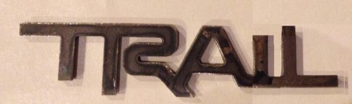
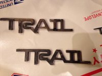
There was a guy posting on a 4Runner Facebook page that he could cut out whatever anyone wanted. I told him I wanted a TRAIL emblem but to make it similar to the TRD logo. Well he delivered!! He did an excellent job! I'm gonna paint them black and put them on the rear pillars.
 

Attachments
  • image.jpg
    image.jpg
    132.5 KB · Views: 15,662
Last edited:
Register to hide this ad
Mine arrived today, gonna spray them gunmetal to match the accents on the rig

Jeff was awesome and super quick. If anyone wants his info hit us up, his prices are awesome and service is great. You have An idea, he can help it come to life
 
Why would I see that? It clearly says TRD Pro

The TRD Pro logo has an indentation between the T and the R. The top left corner of the R is also rounded (as part of the indentation). Visually that breaks the letters apart and makes it look like TRD instead of TTRD. It's a small, but important design element.

But it's a nice clean cut out product. Is it water jet cut, or 3D printed?

Okki
 
The TRD Pro logo has an indentation between the T and the R. The top left corner of the R is also rounded (as part of the indentation). Visually that breaks the letters apart and makes it look like TRD instead of TTRD. It's a small, but important design element.

But it's a nice clean cut out product. Is it water jet cut, or 3D printed?

Okki

I'm going to take a guess and say water jet since it's made out metal.
 
Can you post ups a link to Jeff or contact information. Is there any reason he could not do these in aluminum?
 
It is cnc plasma cut from what Jeff told us. I plan on making the intends to the emblem, it is not complete yet just the initial cut
 
I advise you guys to use some good 3M double back tape on those, and cover the entire back side. Given that there made of metal and not plastic. Id hate to see one fall off and chip some paint on its way down.
 
i agree that the uppercase second "T" reads as "TRATL".

if you shorten the ascender on the "i", and tighten up the kerning between the "AIL" it reads more clearly as "Trail", to my eyes. i like the incorporation of the TRD type—nice touch.

rough edit below, rendered on Pixelmator for iPad:
 

Attachments

  • image.jpg
    image.jpg
    44.6 KB · Views: 2,126
Last edited:
If someone got a more touched up version with sandcrawlers and Cody's suggestions, I'm sure you could get a group buy for about 200 of them in about ten seconds flat. I'd be first to sign up
 

Members online

Forum statistics

Threads
278,307
Messages
3,554,048
Members
248,016
Latest member
Advally Service

Trending content

Back
Top