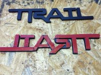
Custom Trail Emblem Made

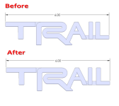
You could always get your dremel out and make a slight releif where the white line is on the image below, shorten the left side to match the right side of the "T", then paint.....
It may break it up as in the TRD logo.

Or have him do a re-do!

just sayin'.....
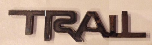
 

Attachments

  • custom-trail-emblem-made-image.jpg
    custom-trail-emblem-made-image.jpg
    50.2 KB · Views: 2,075
I think it looks pretty good. Just narrow the bar at the top of the I a bit and maybe do the Dremel stuff later if you choose. Shortening the I top bar would do quite a bit to make it more legible as Trail.
 
Looks dumb. There are several ways the emblem could be modified to more clearly identify the individual letters. Some good suggestions so far. Also, thread is hilarious that OnPoint gets ass hurt when people criticize him, yet 9/10 of his posts are instigating others. Dish it out but can't take it.
 
Looks dumb. There are several ways the emblem could be modified to more clearly identify the individual letters. Some good suggestions so far. Also, thread is hilarious that OnPoint gets ass hurt when people criticize him, yet 9/10 of his posts are instigating others. Dish it out but can't take it.

Welcome?
 
Looks dumb. There are several ways the emblem could be modified to more clearly identify the individual letters. Some good suggestions so far. Also, thread is hilarious that OnPoint gets ass hurt when people criticize him, yet 9/10 of his posts are instigating others. Dish it out but can't take it.

Welcome to T4R.ORG.... that's one heck of a first post it's got everything in as little space as possible. Insult, constructive criticism, name drop, swearing, statistics, and loose conclusion.... in that order.

You have set the bar pretty high man...:third:
 
Looks dumb. There are several ways the emblem could be modified to more clearly identify the individual letters. Some good suggestions so far. Also, thread is hilarious that OnPoint gets ass hurt when people criticize him, yet 9/10 of his posts are instigating others. Dish it out but can't take it.

Obviously you joined just to troll. Get over it or leave
 
Looks dumb. There are several ways the emblem could be modified to more clearly identify the individual letters. Some good suggestions so far. Also, thread is hilarious that OnPoint gets ass hurt when people criticize him, yet 9/10 of his posts are instigating others. Dish it out but can't take it.

I was going to respond in a much more aggressive manner, but I thought it out and it's apparent no one loves you, so here you go. :kiss:
 
So I have been lurking the forums for a little while as I have been thinking about getting a 4runner for my next car, and I came across this thread and thought I would try my hand at a badge.

This is what I came up with:

GuMiSrj.jpg


If you guys like it I could upload it to shapeways and you could order it 3d printed.
 
So I have been lurking the forums for a little while as I have been thinking about getting a 4runner for my next car, and I came across this thread and thought I would try my hand at a badge.

This is what I came up with:

GuMiSrj.jpg


If you guys like it I could upload it to shapeways and you could order it 3d printed.

Id love to try printing one of these at my office. Can you upload?
 
So I have been lurking the forums for a little while as I have been thinking about getting a 4runner for my next car, and I came across this thread and thought I would try my hand at a badge.

This is what I came up with:

GuMiSrj.jpg


If you guys like it I could upload it to shapeways and you could order it 3d printed.

First, thank you for the input! That looks great! Could you make the I have the top and bottom horizontal lines? It looks too small with out them.
 
So I have been lurking the forums for a little while as I have been thinking about getting a 4runner for my next car, and I came across this thread and thought I would try my hand at a badge.

This is what I came up with:


If you guys like it I could upload it to shapeways and you could order it 3d printed.

Man that looks great! I have one minor suggestion, sorry OCD, there is a lot of "air" in between the "A" and the "I" .If you left the "L" where it is and bumped the "I" a little closer to the "A" it would balance out a little better. I would pitch in for 3d prints. :thumb:

Errr... nevermind I see you posted the .stl
 

Attachments

  • trail.png
    trail.png
    79.8 KB · Views: 2,801
Last edited:

Members online

No members online now.

Forum statistics

Threads
278,309
Messages
3,554,071
Members
248,016
Latest member
Advally Service

Trending content

Back
Top