sandcrawler
Senior Member
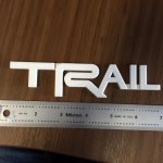
kerning. ayup.Man that looks great! I have one minor suggestion, sorry OCD, there is a lot of "air" in between the "A" and the "I" .If you left the "L" where it is and bumped the "I" a little closer to the "A" it would balance out a little better. I would pitch in for 3d prints. :thumb:
Errr... nevermind I see you posted the .stl