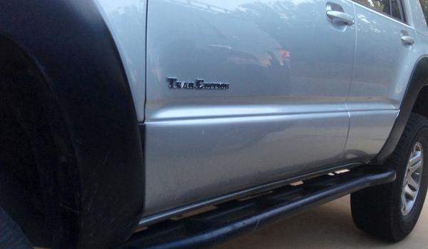
I definitely like the direction this is headed, but the I and L seem to be smaller than the T and A. They dont look proportional. Anyone else have the ability to draft something up?
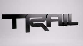
Looks like using the "TR" from a TRD logo is goofing it all up. Looks better than the original but the "T" is huge compared to the rest. Its getting there! :thumb:
I definitely like the direction this is headed, but the I and L seem to be smaller than the T and A. They dont look proportional. Anyone else have the ability to draft something up?
Speed model (not going to finish modelling it if it isn't worth it) and a fully ghetto render but just had an idea I thought looked a little more cohesive, the A I L still feel pretty heavy but certainly open to suggestions:
Speed model (not going to finish modelling it if it isn't worth it) and a fully ghetto render but just had an idea I thought looked a little more cohesive, the A I L still feel pretty heavy but certainly open to suggestions:
Still need to chamfer the "R" but that'd take me another 20 minutes to fix the intersections and then smooth it nice. Just a quick draft (well an hour anyway)
Speed model (not going to finish modelling it if it isn't worth it) and a fully ghetto render but just had an idea I thought looked a little more cohesive, the A I L still feel pretty heavy but certainly open to suggestions:
Looks great!!! On the fence about the A. I'm not sure if i like the vertical leg of it... Can you make it a regular A and keep all the proportions as they are??
Ideally you want the weight of all the letters to match. Right now the "TR" are much heavier and wider than the "AIL". Not saying this is the answer but you can kind of see what i mean
Ideally you want the weight of all the letters to match. Right now the "TR" are much heavier and wider than the "AIL". Not saying this is the answer but you can kind of see what i mean
Ideally you want the weight of all the letters to match. Right now the "TR" are much heavier and wider than the "AIL". Not saying this is the answer but you can kind of see what i mean
Ideally you want the weight of all the letters to match. Right now the "TR" are much heavier and wider than the "AIL". Not saying this is the answer but you can kind of see what i mean
Is there any way for you to post the cad file on the site that the other guy did so some of us could try and cut it on a 3D printer? You did an awesome job on the logo and Im really interested to see what it would look like on a vehicle.